
Introduction: Blue-Green and the Battle for Serenity
In the world of color, few combinations are as beloved as the soothing blend of blue and green. At the heart of this spectrum lie two close cousins—Teal and Turquoise—each evoking feelings of peace, nature, clarity, and cool sophistication.
Though often used interchangeably in fashion, design, and decor, Teal and Turquoise are not the same. One leans more into oceanic depth, the other into tropical brightness. One whispers elegance, the other dances with playful charm.
Whether you're choosing paint, branding colors, gemstones, or interior textiles, understanding the subtle yet impactful difference between Teal and Turquoise can elevate your creative decision-making.
This in-depth guide explores the origin, symbolism, emotional impact, and application of these two beloved shades—so you can choose with intention and confidence.
What Is Teal?
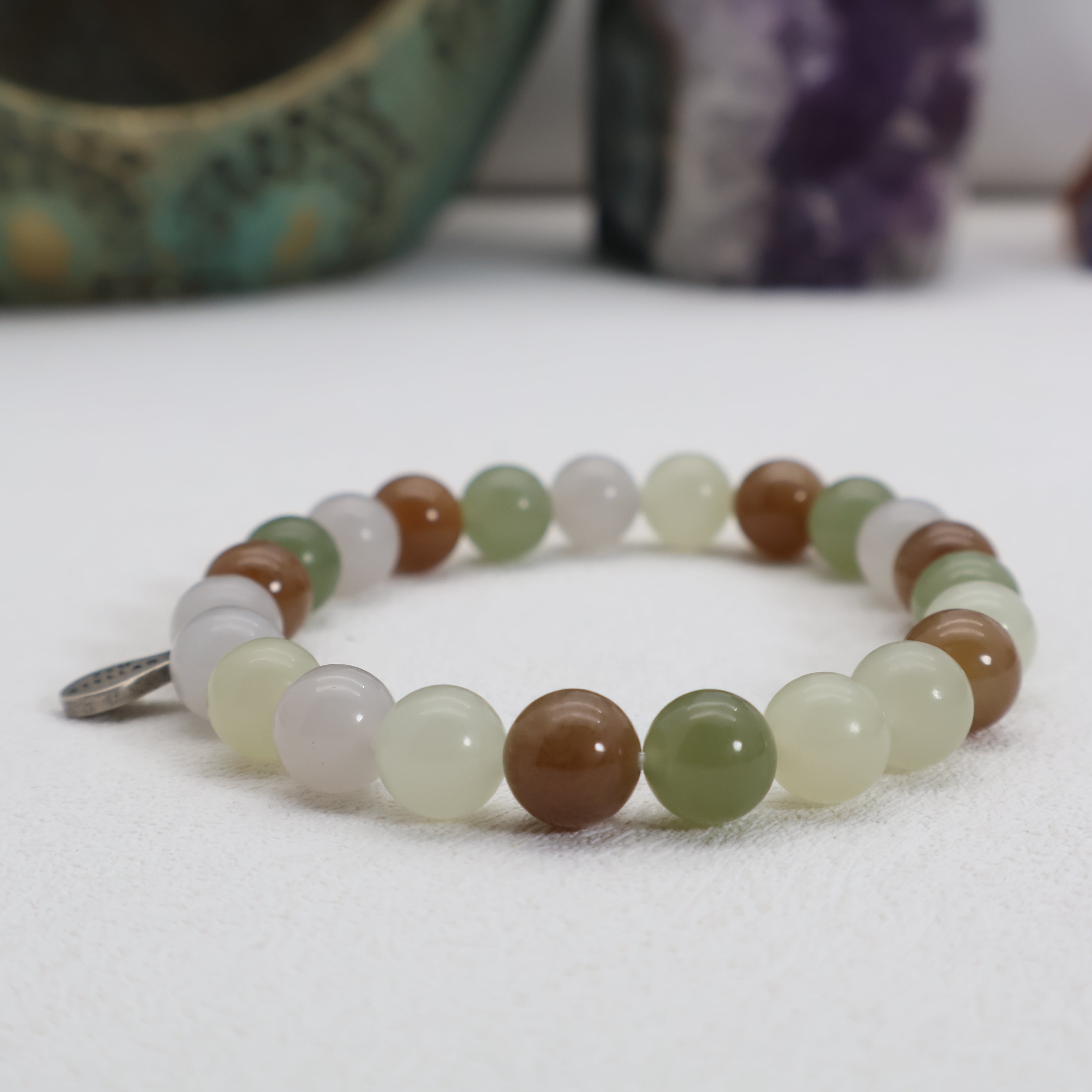
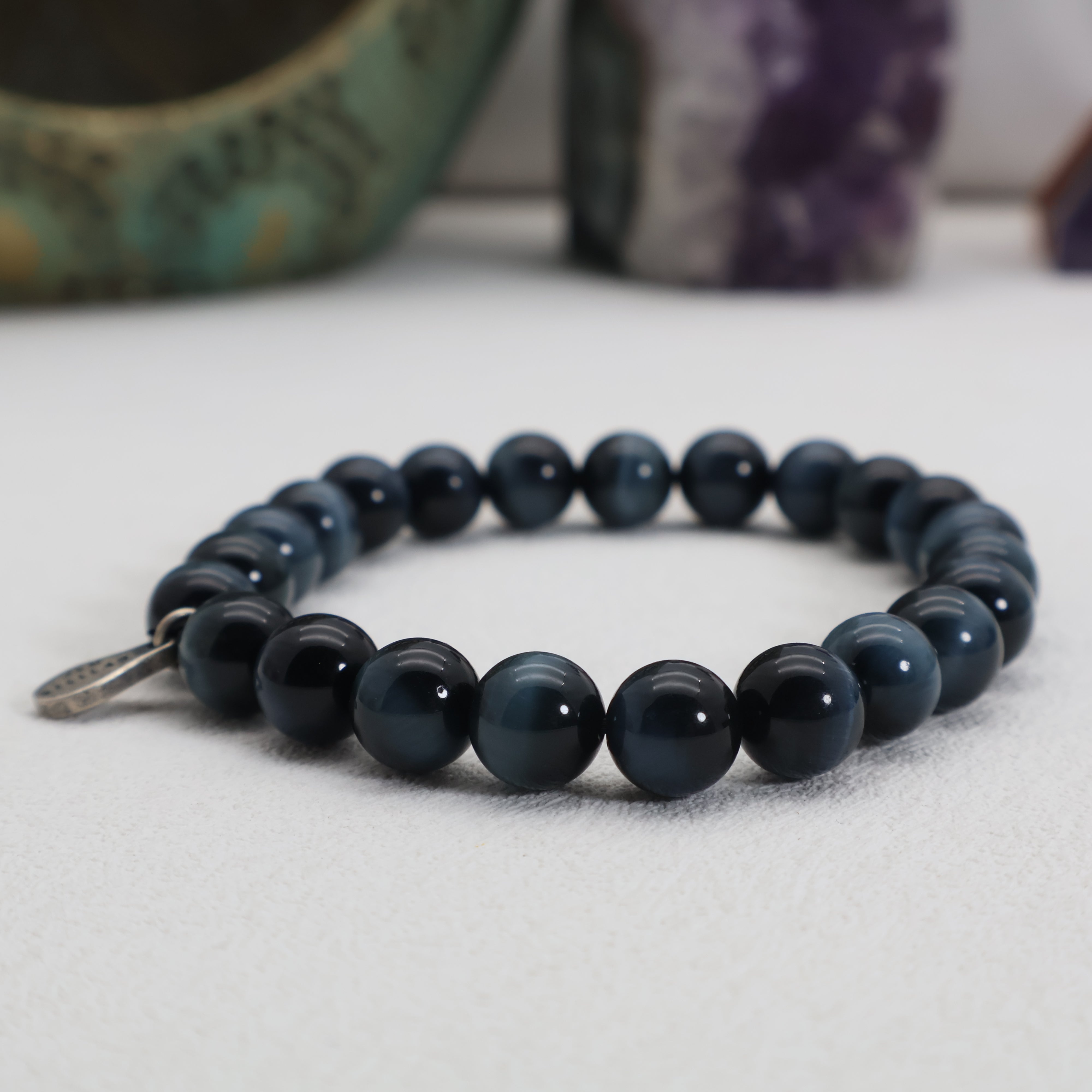
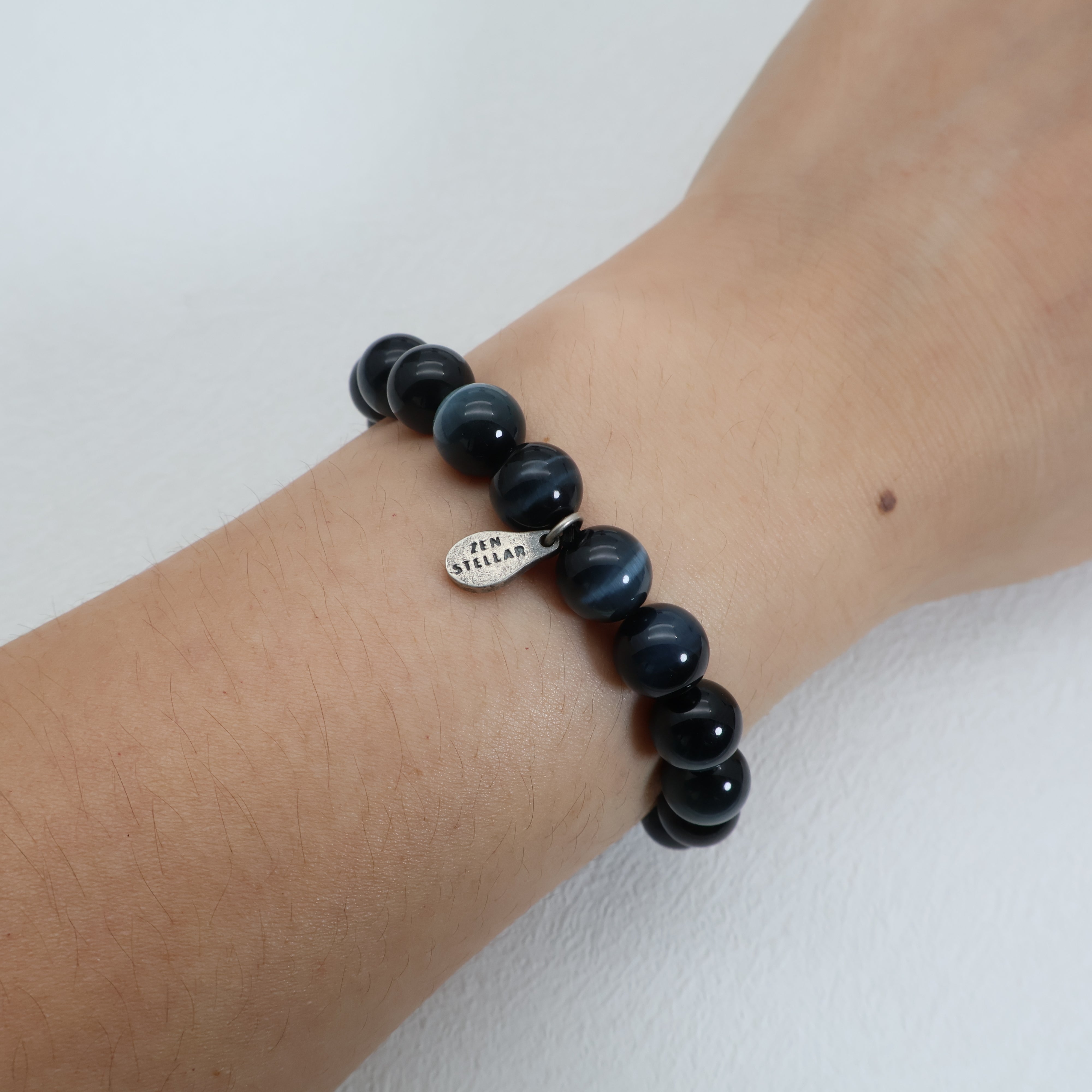
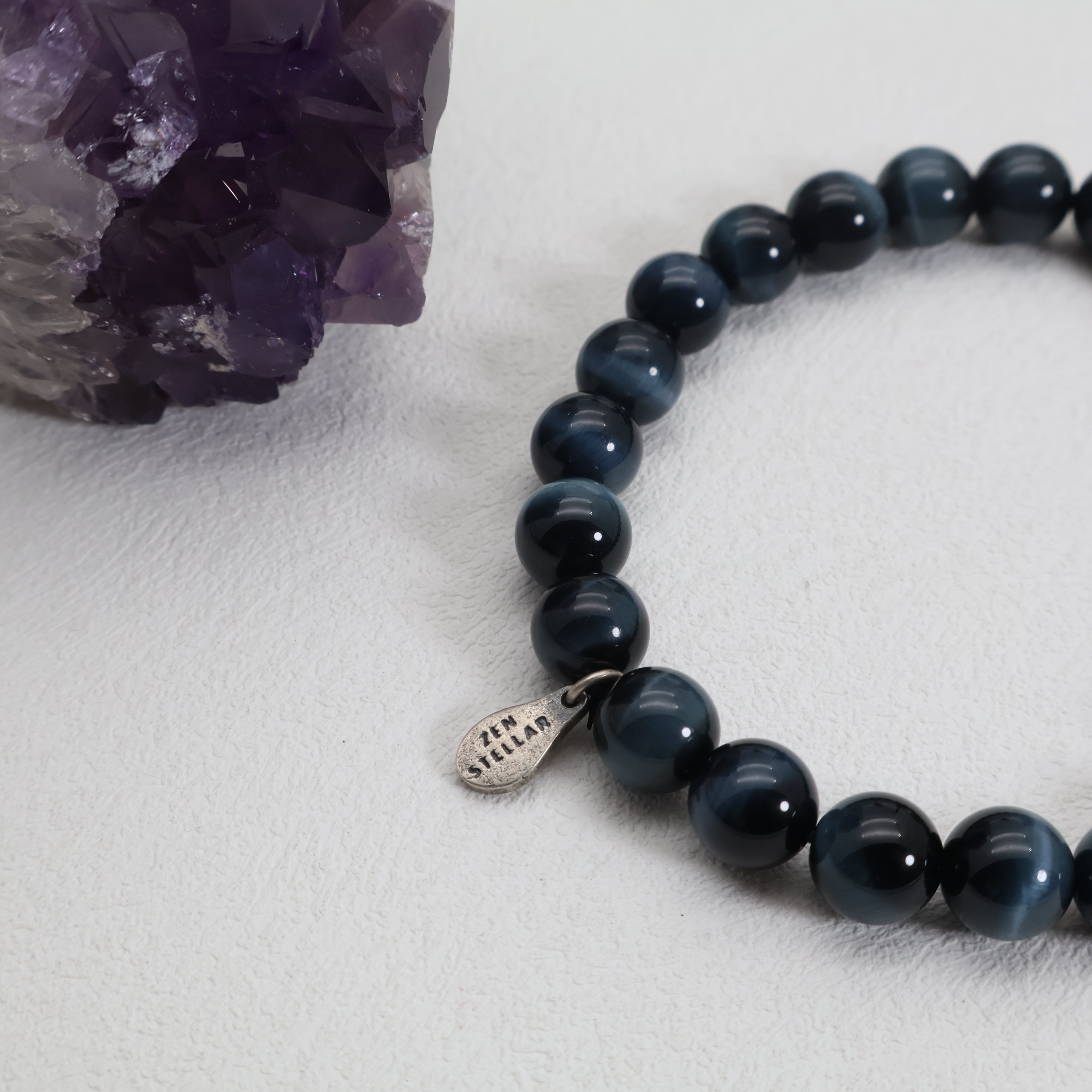
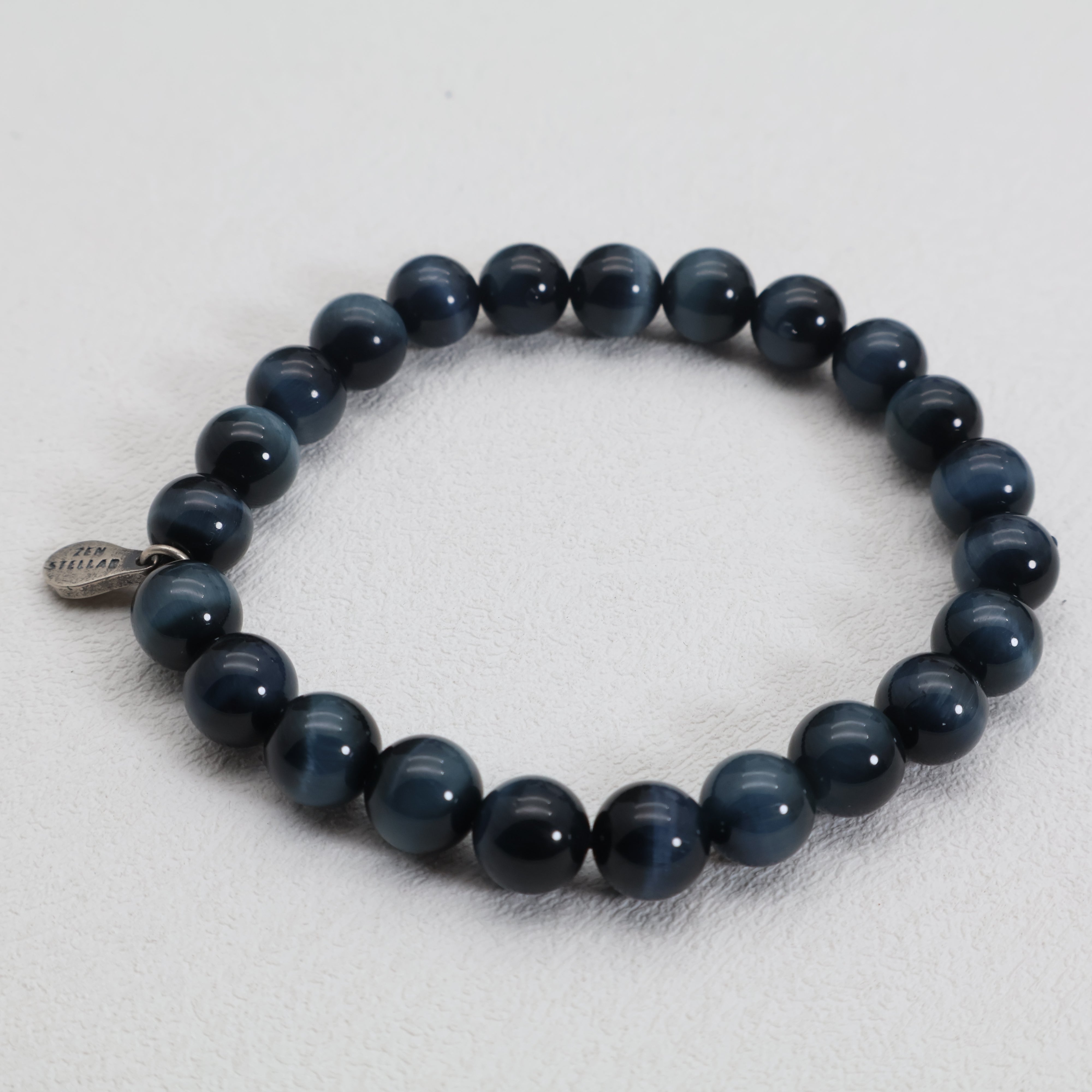
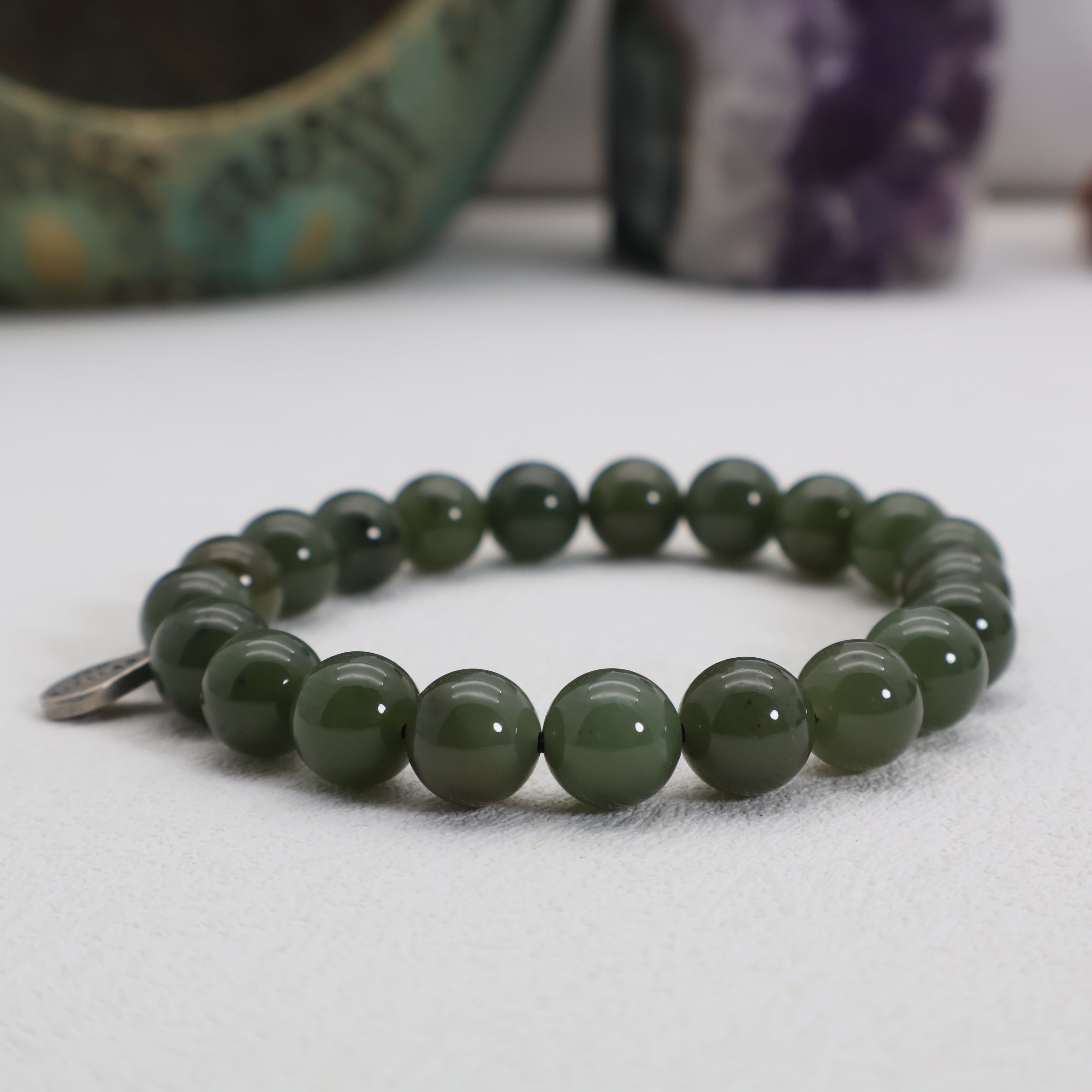
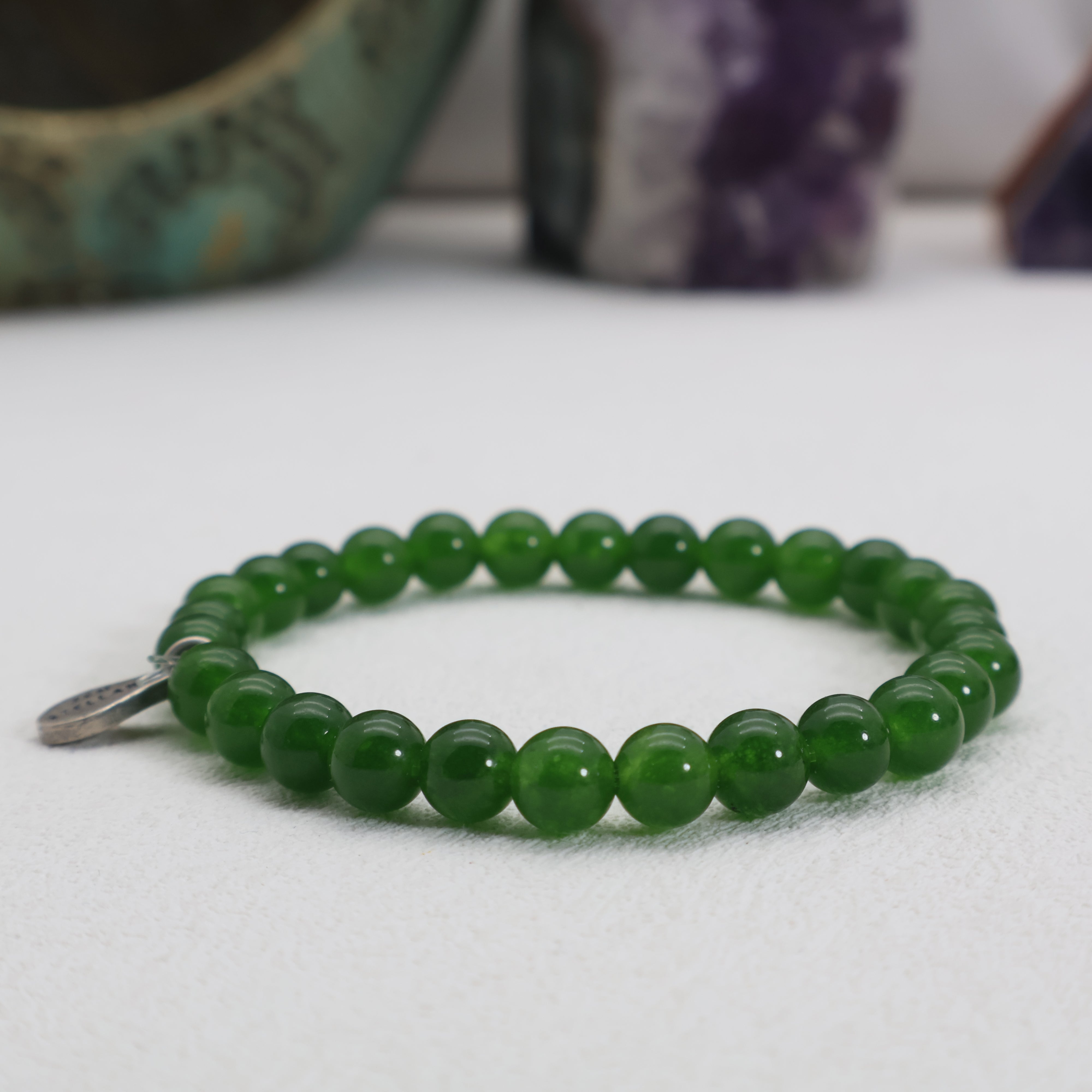
Teal is a medium to dark tone of cyan-blue that sits between green and blue on the color wheel. It takes its name from the common teal duck, whose striking head plumage features this color.
Rich and balanced, Teal has a muted vibrancy that conveys depth, sophistication, and tranquility. It feels cool, confident, and contemplative—like a forested lake beneath a stormy sky.
In design, Teal offers a modern, mature alternative to bright blues or greens. It's highly versatile, working well in both minimal and maximal aesthetics. In color psychology, it promotes emotional clarity, calm thought, and a sense of grounded self-assurance.

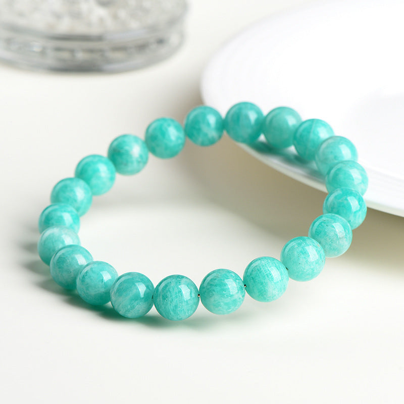
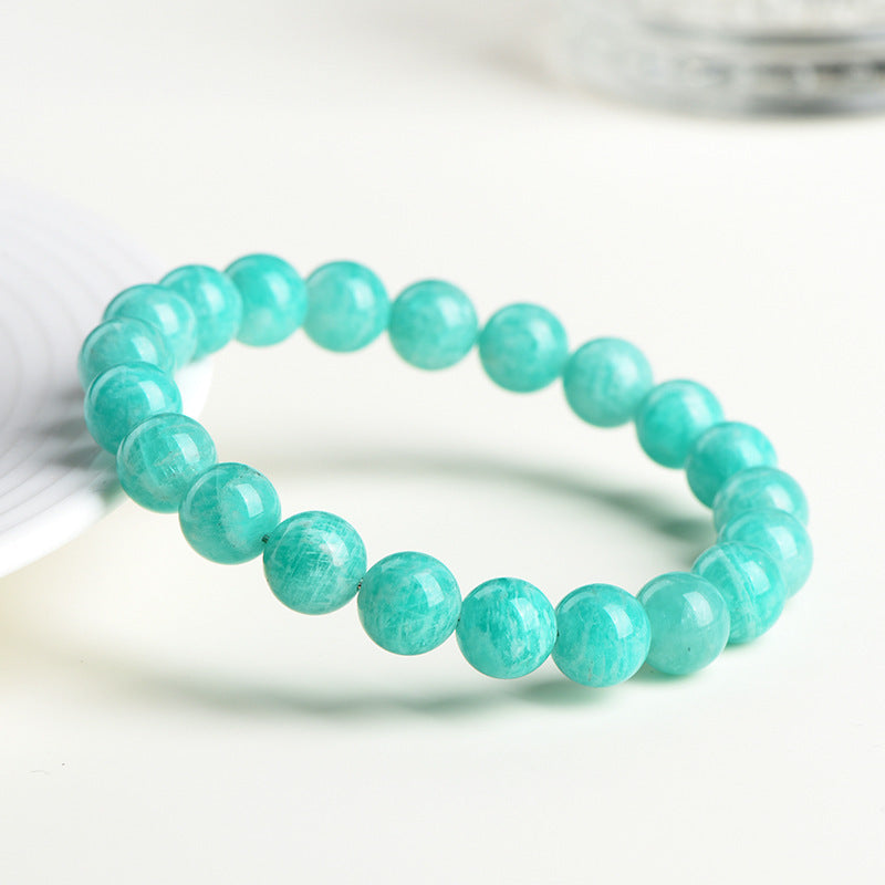
What Is Turquoise?
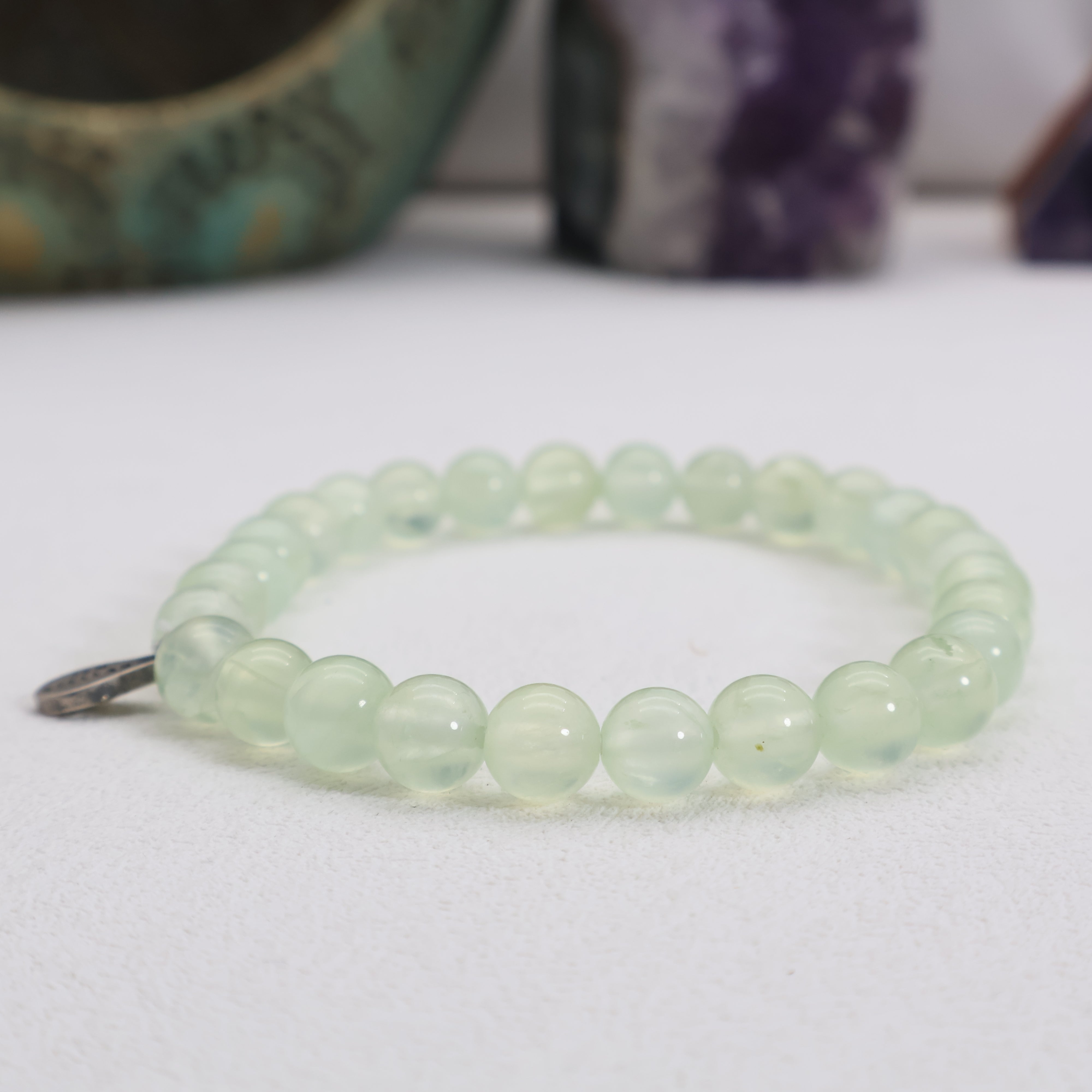
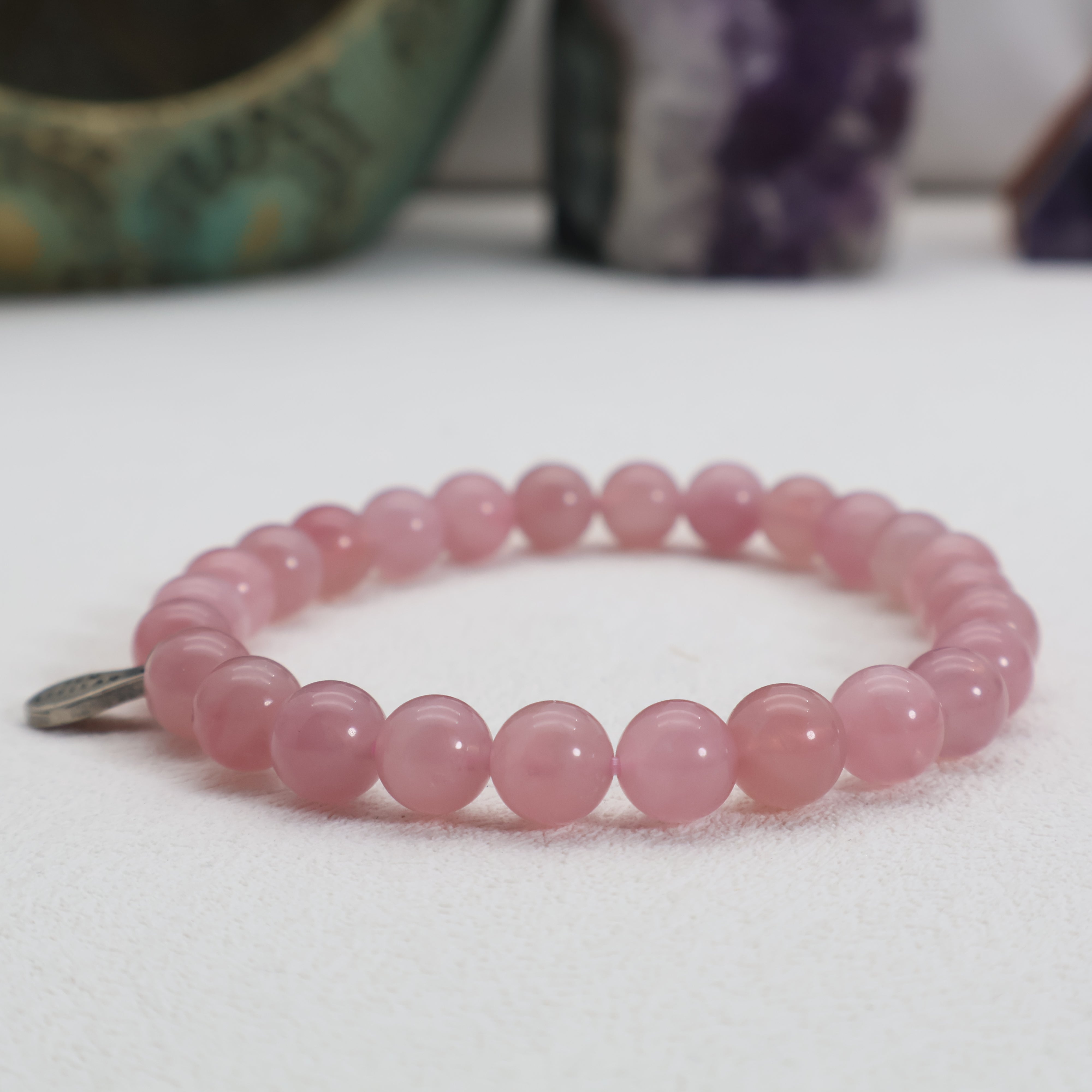
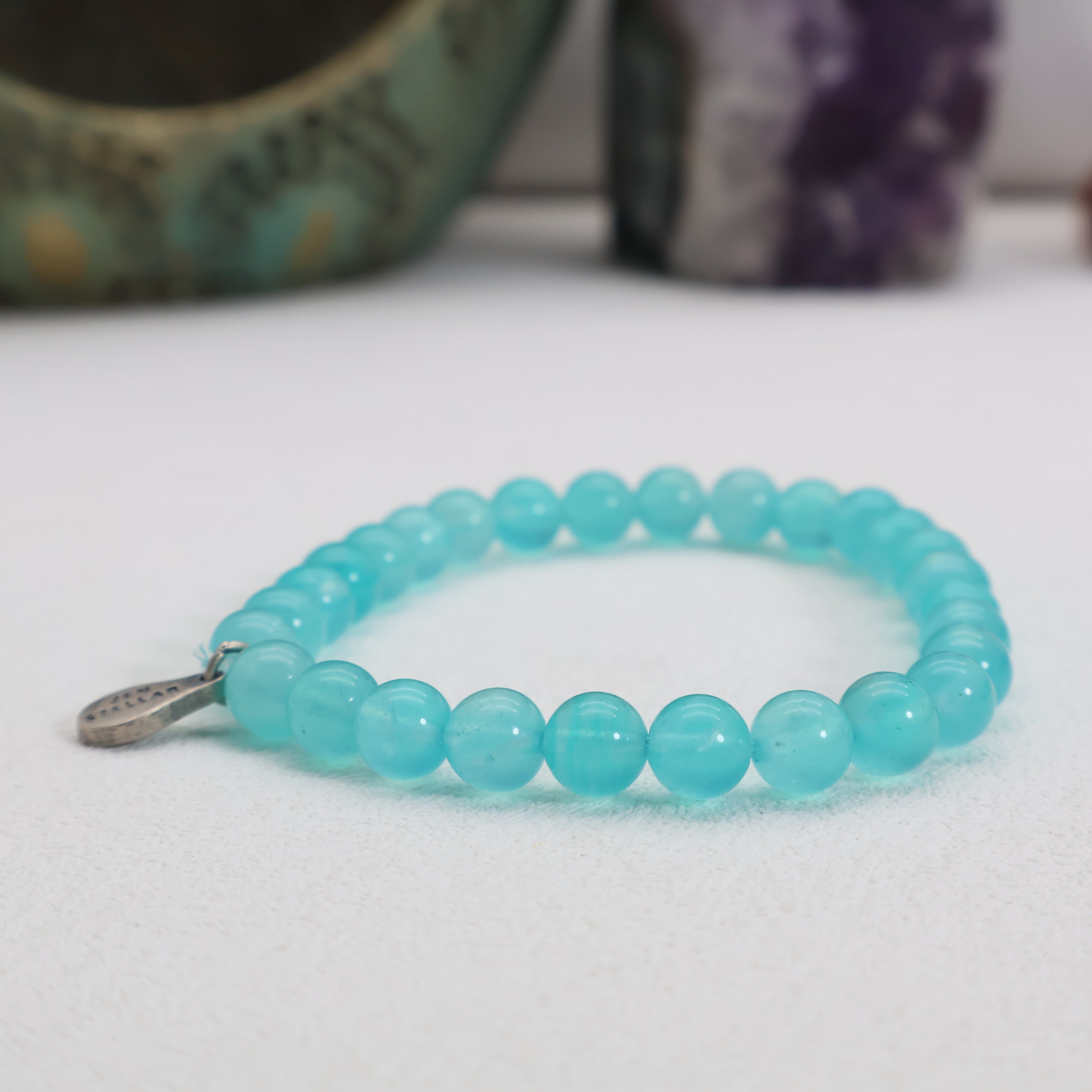
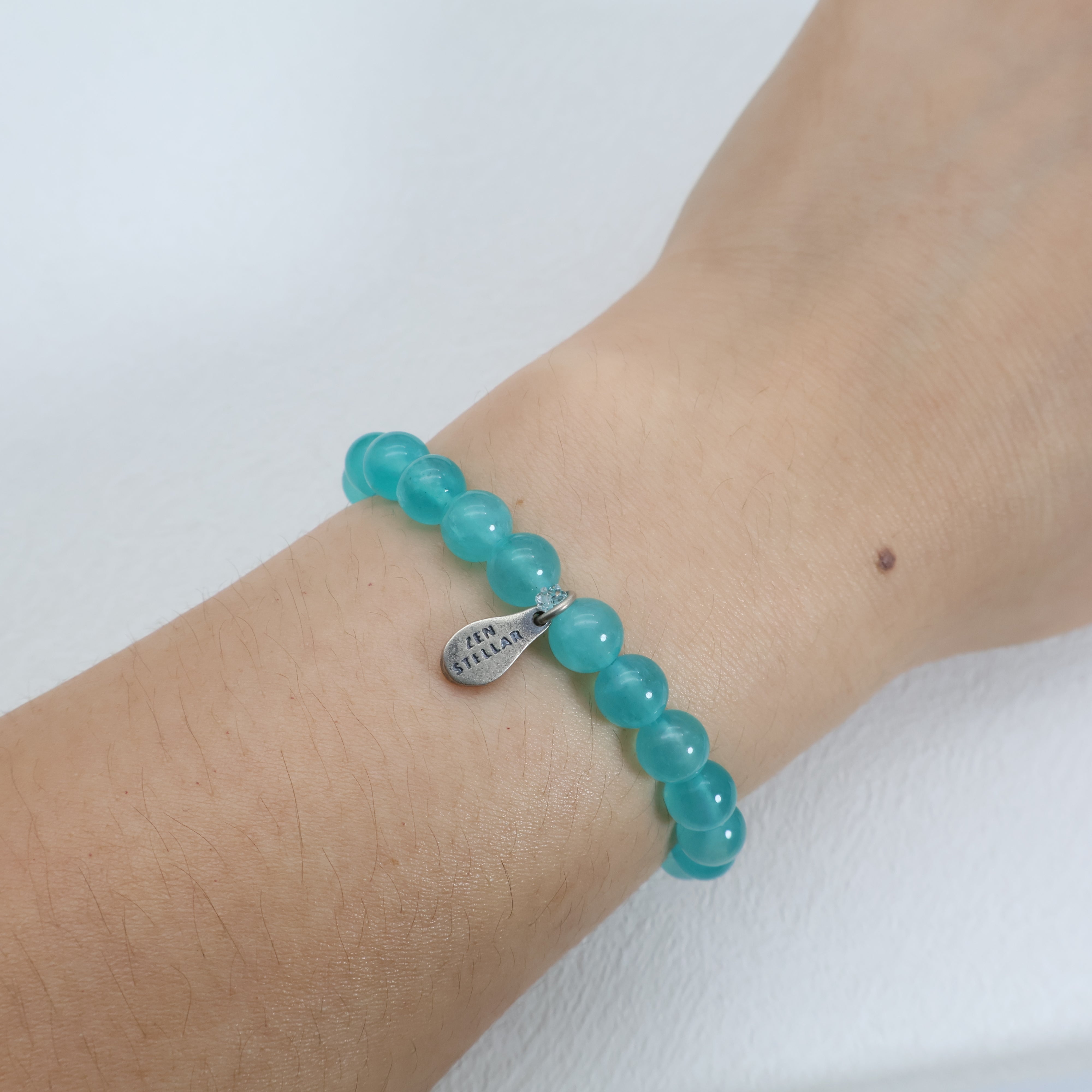
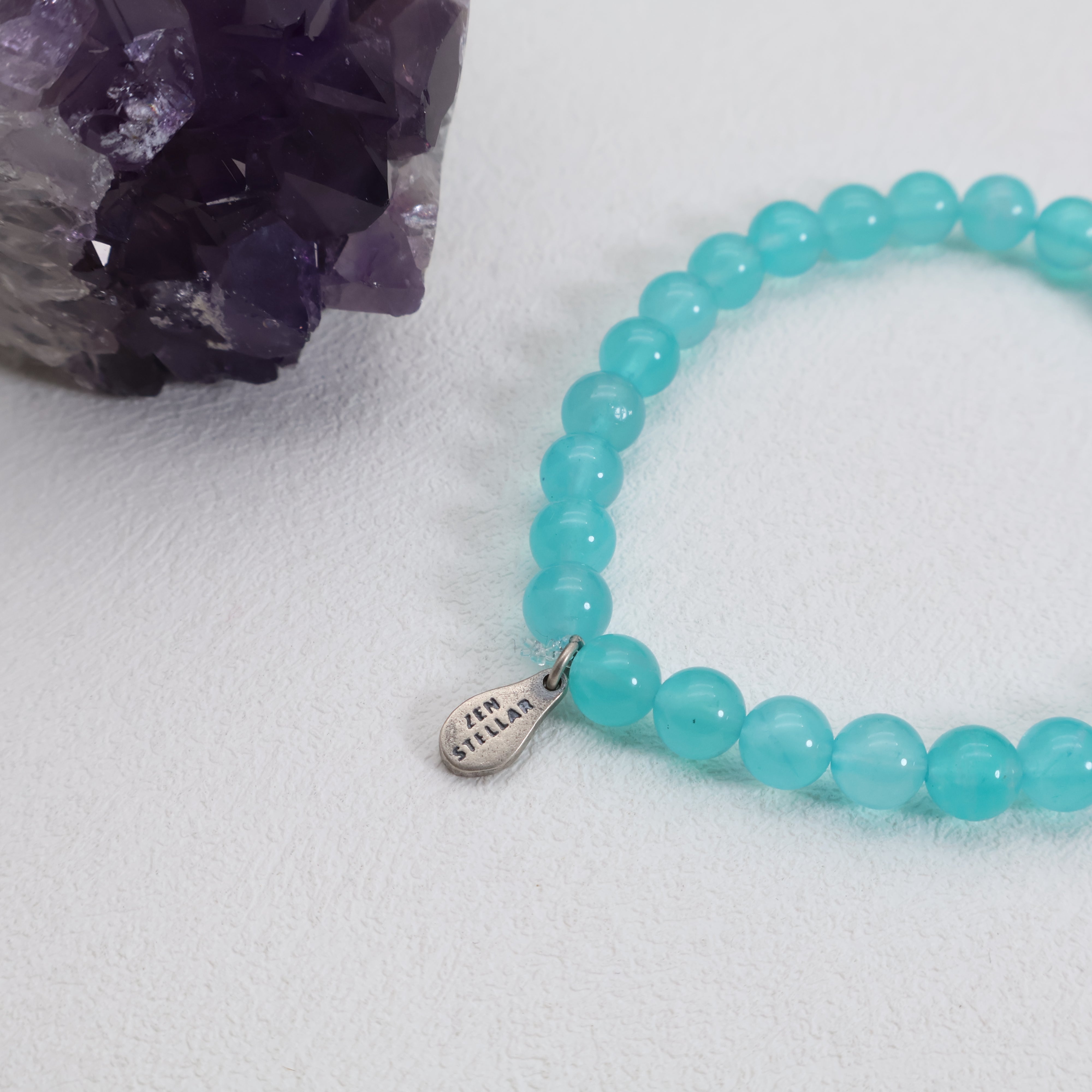
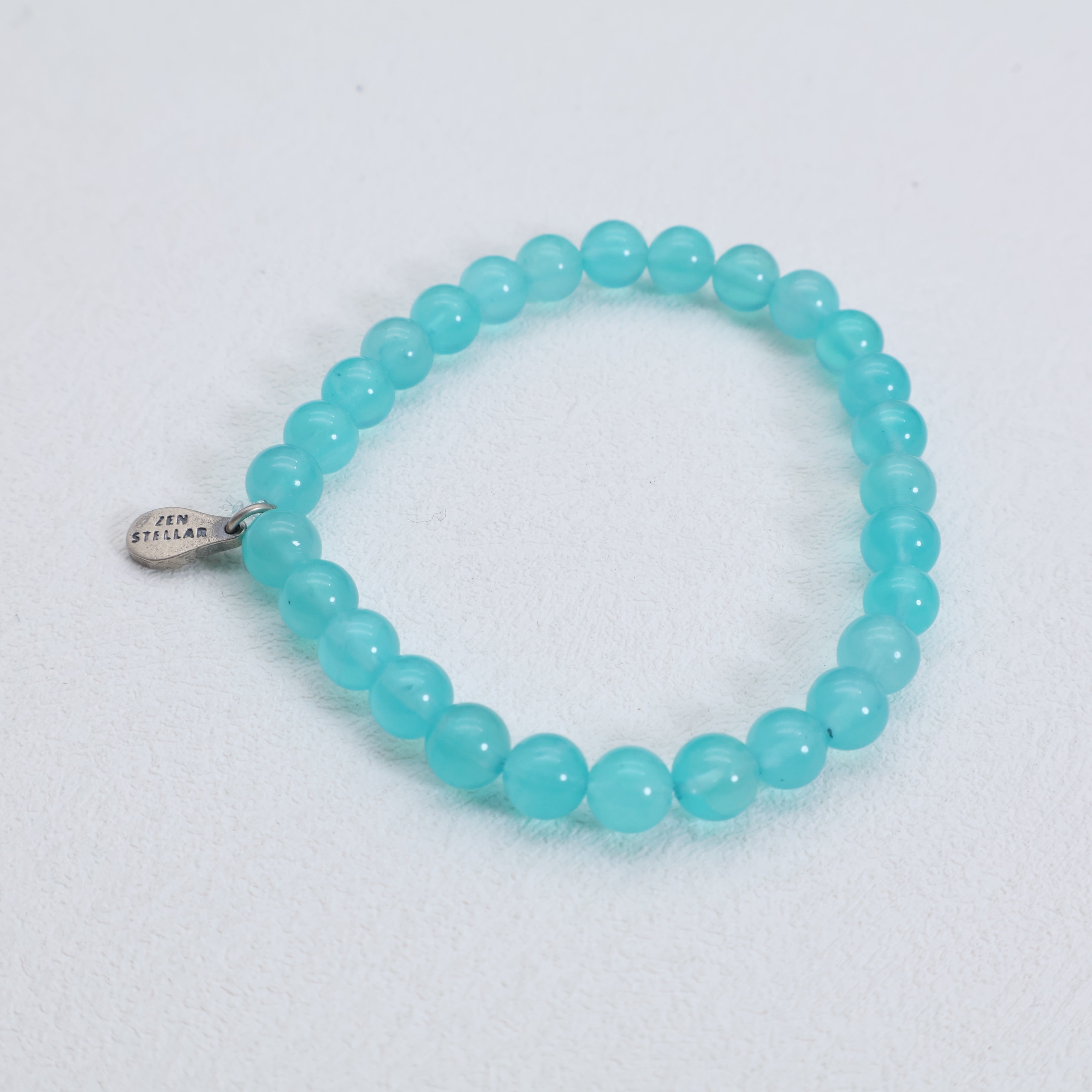
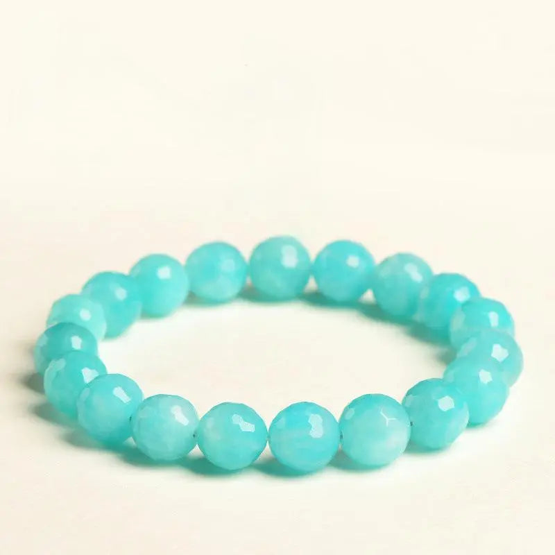
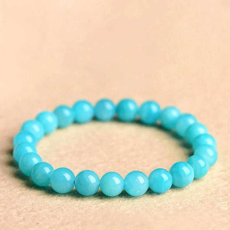
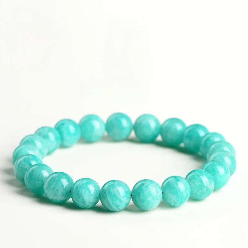
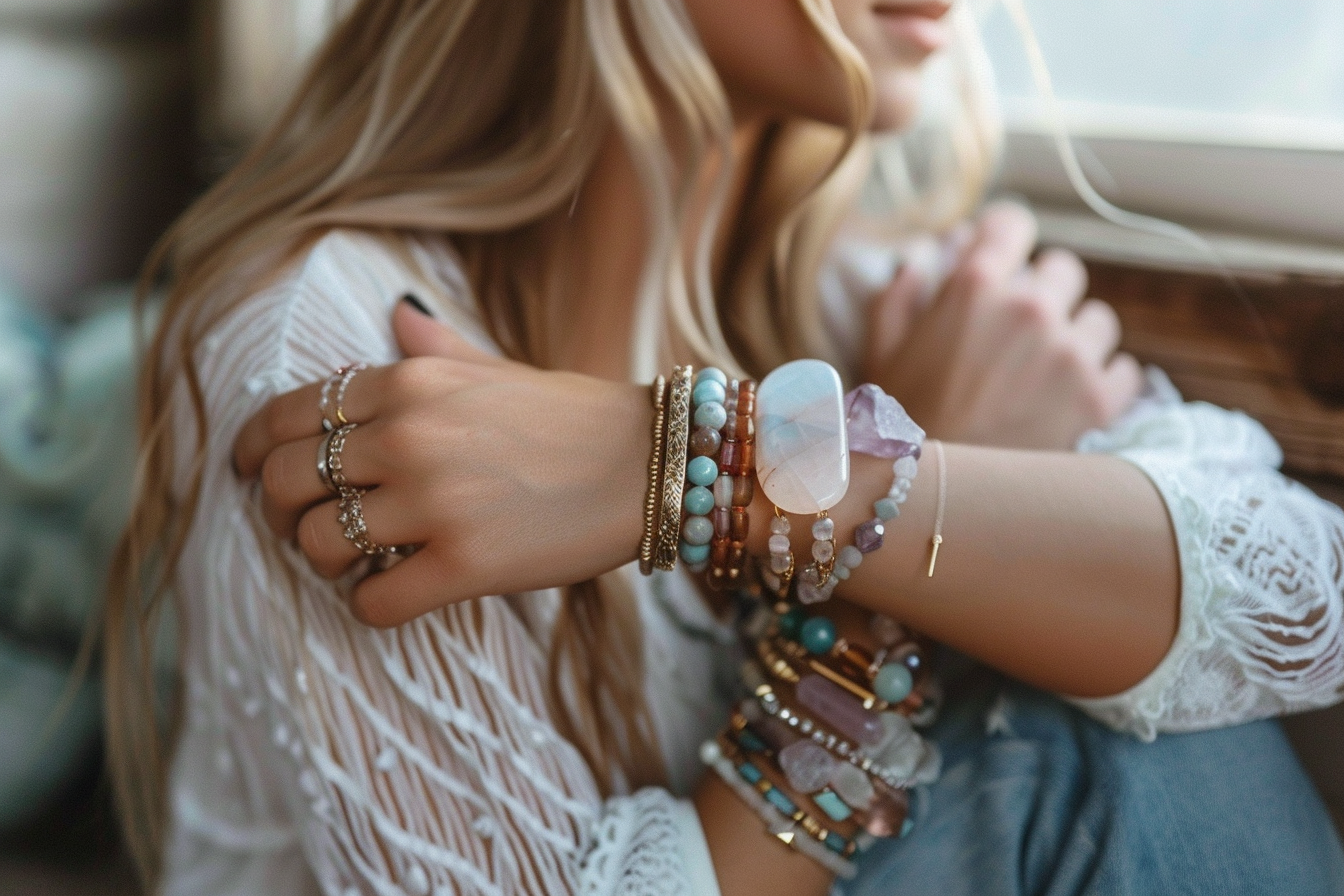
Turquoise is a lighter, brighter blue-green color named after the rare and ancient gemstone of the same name. It contains more white than Teal, giving it a clear, clean, and radiant appearance reminiscent of Caribbean seas or glacial pools.
The color turquoise has long been associated with protection, spiritual attunement, and healing across cultures—from Native American symbolism to ancient Persian art.
In modern use, Turquoise represents vibrancy, open-mindedness, and creative energy. It brings a sense of youthful freshness, often used to evoke tropical escapes, summer vitality, or mindfulness-focused branding.

Visual and Emotional Contrast: Depth vs Radiance
Teal appears as a deeper, moodier hue, often with gray or black undertones. It suggests elegance, introspection, and control. Teal doesn’t seek attention—it earns admiration.
Turquoise, on the other hand, sparkles with lightness and energy. It’s playful, uplifting, and emotionally expressive. While Teal reflects a calm lake under cloud cover, Turquoise is the sunlit surface of a tropical bay.
Emotionally, Teal promotes self-reflection and inner peace. Turquoise inspires spontaneity and healing joy.
Symbolism and Cultural Meaning
Teal is often associated with clarity, trustworthiness, and refined communication. In branding, it suggests intelligence, stability, and modern sensibility. Teal ribbons are also used to raise awareness for ovarian cancer and PTSD, giving the color a powerful social presence.
Turquoise holds deep spiritual symbolism in many ancient cultures. It was used in Egyptian tombs, Persian talismans, and Native American ceremonial jewelry. It symbolizes protection, communication, and spiritual attunement.
In modern color therapy, Teal supports calm thinking, while Turquoise is used to enhance creative flow and emotional expression.
Where They Sit on the Color Spectrum
Teal is a darker blend of blue and green with low brightness and medium to high saturation. It often leans slightly more blue than green, depending on the variation.
Turquoise is a brighter, lighter blend, with more white mixed in. It sits closer to cyan and leans more green than pure blue in its most traditional expressions.
While both sit between green and blue, Teal feels duskier and heavier, and Turquoise feels brighter and more luminescent.

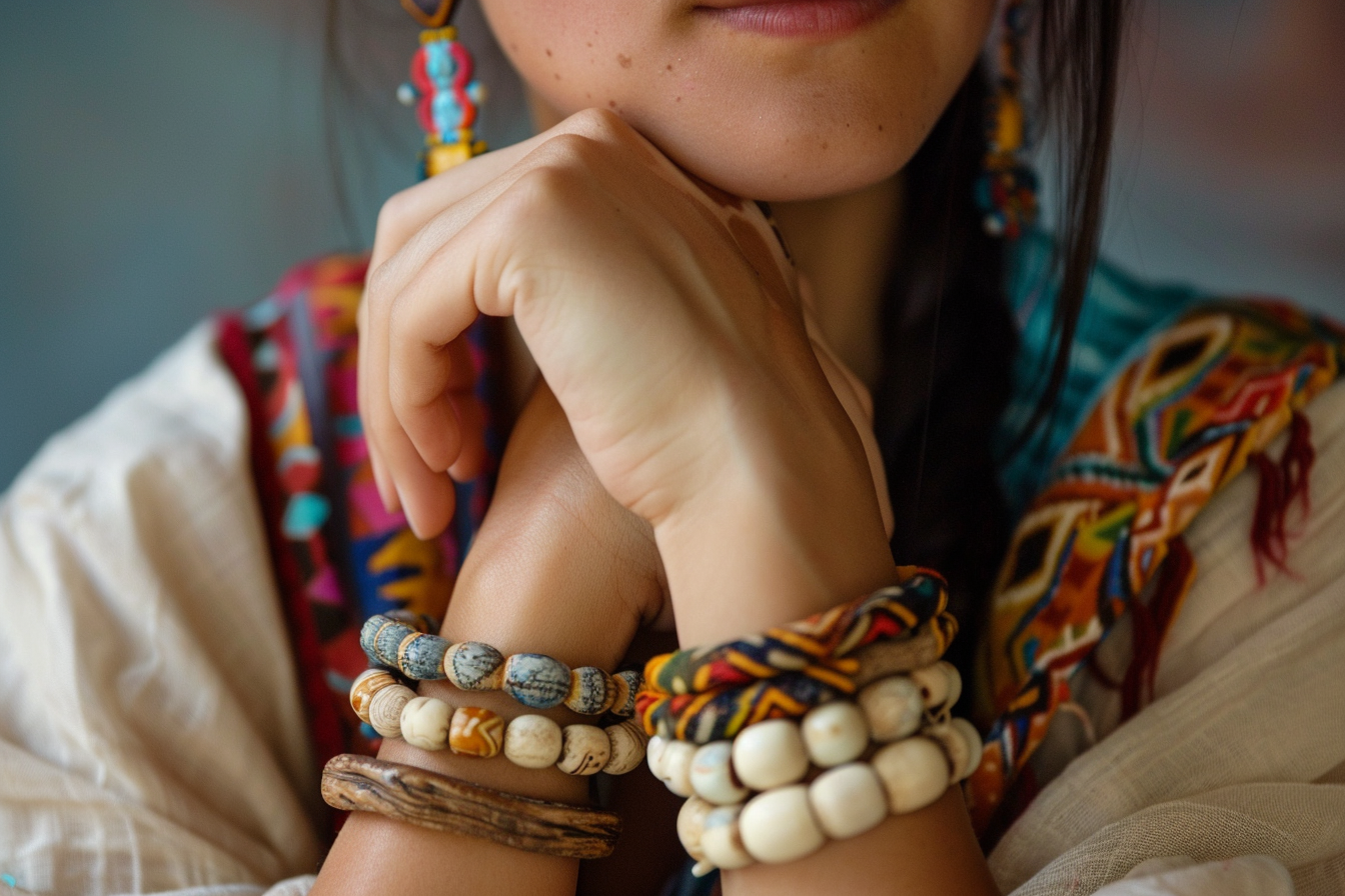
Use in Fashion and Personal Style
Teal is a power color in the fashion world—used in evening wear, suiting, and accessories for both men and women. It flatters a wide range of skin tones and transitions easily between seasons. In capsule wardrobes, Teal offers a jewel-toned neutral that adds depth without boldness.
Turquoise is more casual, fun, and youthful. It’s a staple in beachwear, bohemian styles, and summer accessories. It pops against warm skin and pairs beautifully with coral, white, and gold.
Teal says, “I’m grounded and in control.”
Turquoise says, “I’m free, inspired, and open to play.”
Use in Interior Design
Teal adds richness and modernity to interiors. It works beautifully in velvet furniture, bathroom tiles, and feature walls. In darker rooms, it creates intimacy and warmth. Pair it with brass, cream, or walnut wood for a mid-century or contemporary aesthetic.
Turquoise brings life and movement. It’s ideal for accent walls, coastal-themed rooms, or eclectic color stories. Use it in kitchens, home offices, or sunrooms to inspire brightness and flow. It complements light wood, white, and bright floral palettes.
If you want a room to feel cozy and thoughtful, use Teal. If you want it to feel bright and cheerful, use Turquoise.
Psychological Effects and Color Therapy
Teal calms the nervous system. It helps with anxiety, overwhelm, and decision fatigue. In therapy rooms or meditation spaces, it encourages neutrality and calm focus. It’s also a strong color for self-regulation and deep reflection.
Turquoise lifts the mood. It fosters emotional release, encourages clear communication, and is often used in healing arts. It’s especially effective for balancing the throat chakra and aiding in expressive therapy, art journaling, or affirmational work.
Use Teal when you need mental stillness.
Use Turquoise when you need emotional momentum.

Can They Be Used Together?
Absolutely—and when used skillfully, the result is elegant, layered, and unforgettable.
Teal can serve as the grounding base or primary color, while Turquoise acts as the highlight or accent. Together, they create a harmonious spectrum of blue-green that’s soothing yet vibrant.
In design, branding, or personal style, combining the two adds both depth and freshness. For example:
-
In interior design: Teal walls with Turquoise cushions.
-
In fashion: A Teal blazer with Turquoise jewelry.
-
In digital branding: Teal buttons with Turquoise hover effects.
Together, they offer a visual balance of earth and sky, thought and feeling, foundation and freedom.
Real-Life Stories and Reflections
A yoga studio painted its walls Teal and accented with Turquoise props. Students described the space as “deeply peaceful, but also full of life.”
A graphic designer shared that she used Teal for her portfolio website and Turquoise for her wellness coaching brand. “Teal made me feel credible. Turquoise made me feel approachable.”
A therapist shared how she wears a Turquoise pendant to invite emotional openness in clients, while decorating her office in Teal tones for calming presence. “Together, they say—‘you are safe to express.’”
Maintenance and Matching Tips
Teal is relatively easy to work with—it pairs well with neutrals, metallics, and other jewel tones. It’s stable and rarely clashes. However, in poorly lit spaces, too much Teal can feel heavy. Always balance it with light.
Turquoise is bolder and more reactive. It pops beautifully but can overwhelm if overused. Match it with soft naturals (like sand, white, or light gray) or use it in moderation as an accent.
If you’re unsure which to start with:
-
Try Teal in larger areas like walls, couches, or suits.
-
Use Turquoise in smaller elements like jewelry, pillows, or digital UI highlights.
Choosing Between Teal and Turquoise
Choose Teal if you want:
-
A grounded, mature, and calming aesthetic
-
Rich depth and emotional composure
-
A versatile, modern color that suits professional spaces
-
A jewel-toned alternative to navy or forest green
Choose Turquoise if you want:
-
A vibrant, joyful, and expressive energy
-
Lightness, creativity, and spiritual connection
-
Summer brightness or coastal aesthetics
-
A bridge between playful and peaceful
Trust your instinct. If you feel called inward and steady, Teal may be your color. If you feel ready to move, create, and connect, Turquoise is likely calling.
Final Thoughts: Still Waters and Sparkling Shores
Teal and Turquoise are more than colors—they are emotional atmospheres.
Teal grounds you in depth and wisdom. It encourages introspection, presence, and peace.
Turquoise lifts you with clarity and creativity. It inspires joy, expression, and energetic movement.
Together, they form a spectrum of blue-green brilliance—a reminder that you can be both centered and expressive, both deep and light.
No matter which you choose, know that both hues offer a space to breathe, grow, and return to yourself.
Frequently Asked Questions (FAQs)
Is Turquoise just a lighter Teal?
No. While both are blue-green blends, Turquoise contains more white and often leans greener, while Teal is darker, richer, and moodier.
Are Teal and Turquoise suitable for both men and women?
Absolutely. Both colors are gender-neutral and used widely in unisex fashion and branding.
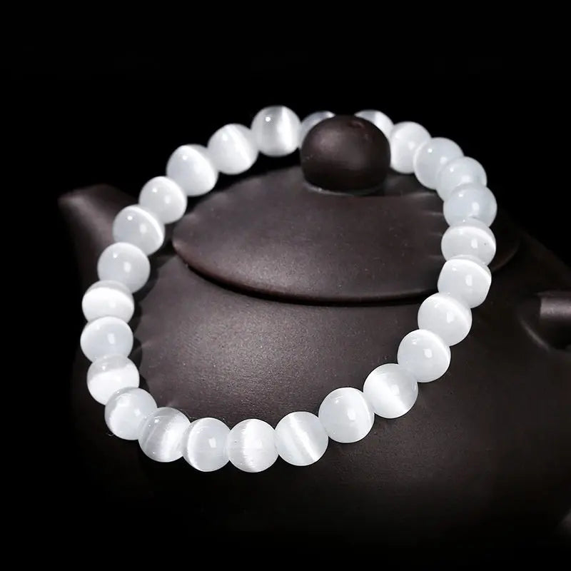
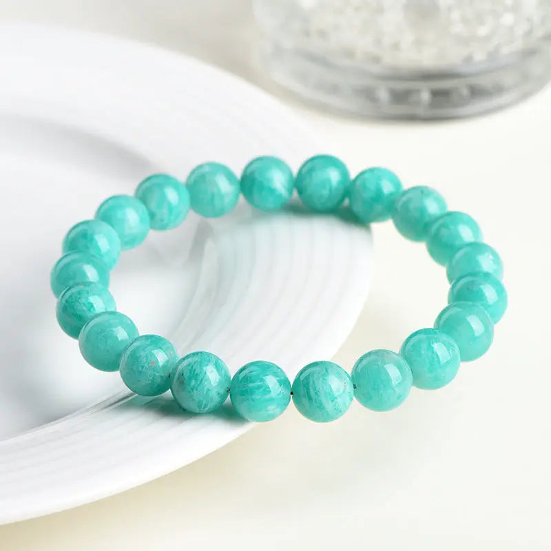
Do these colors have gemstone counterparts?
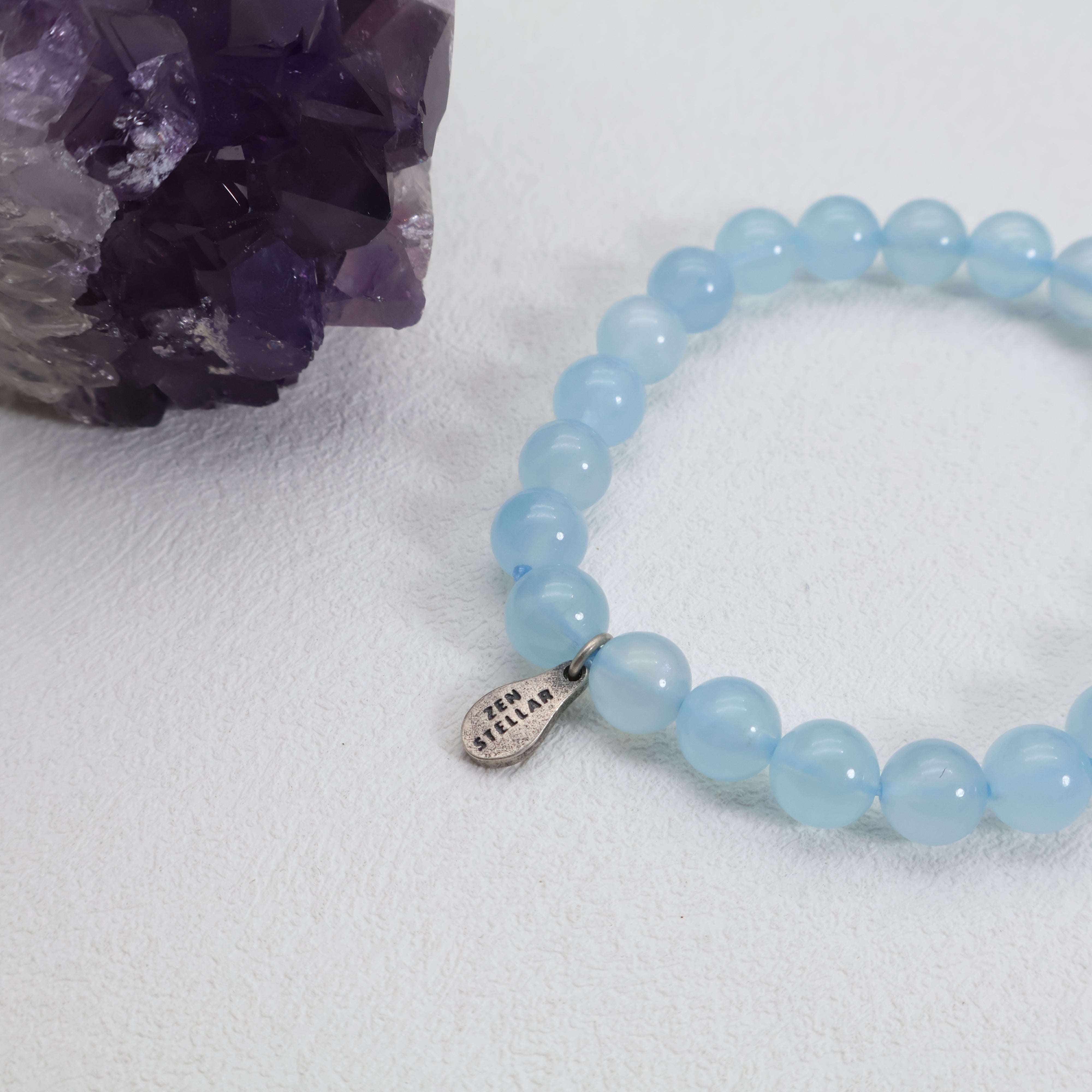
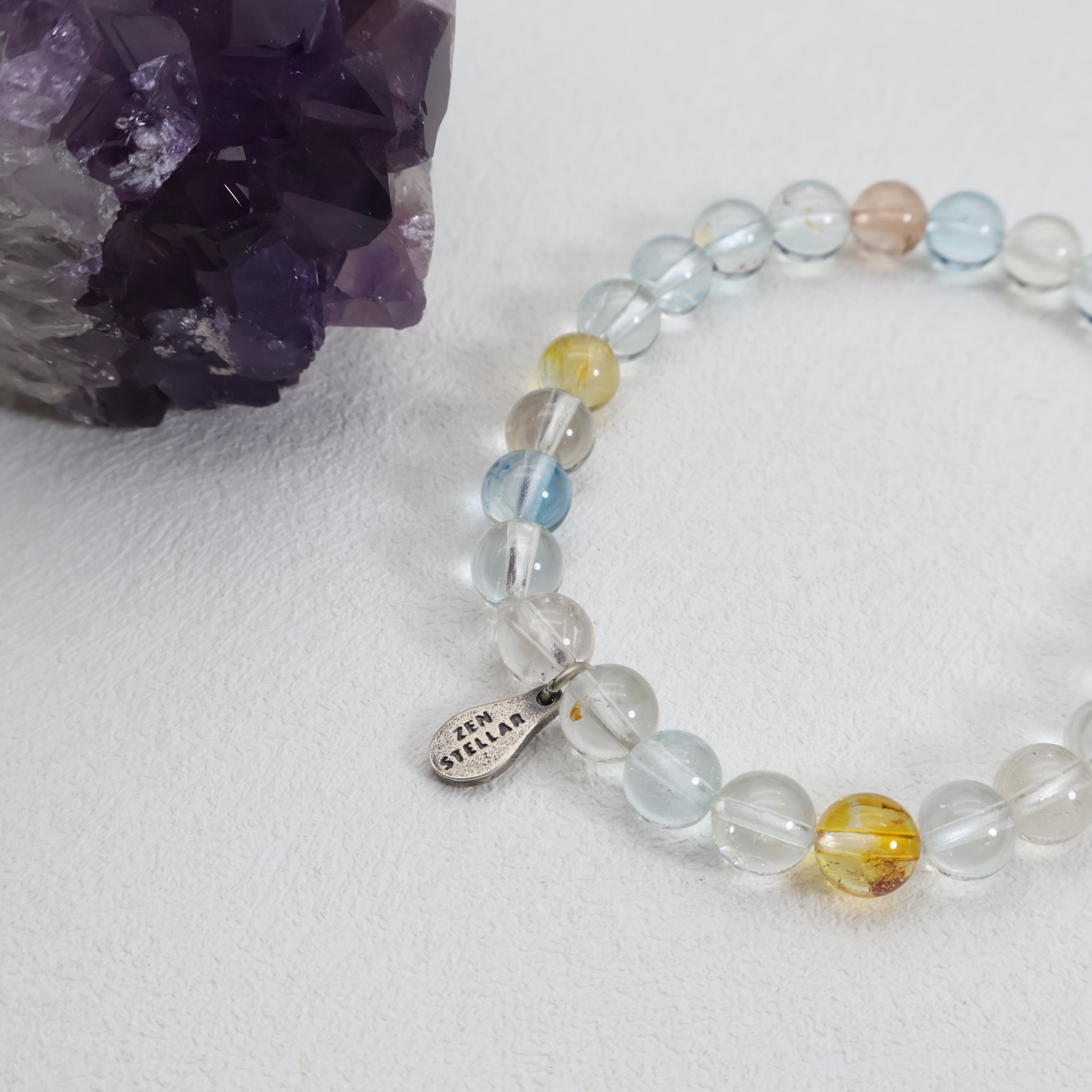
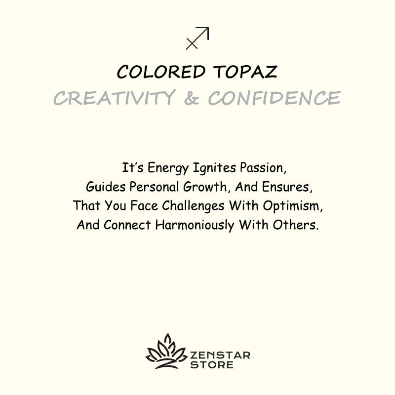
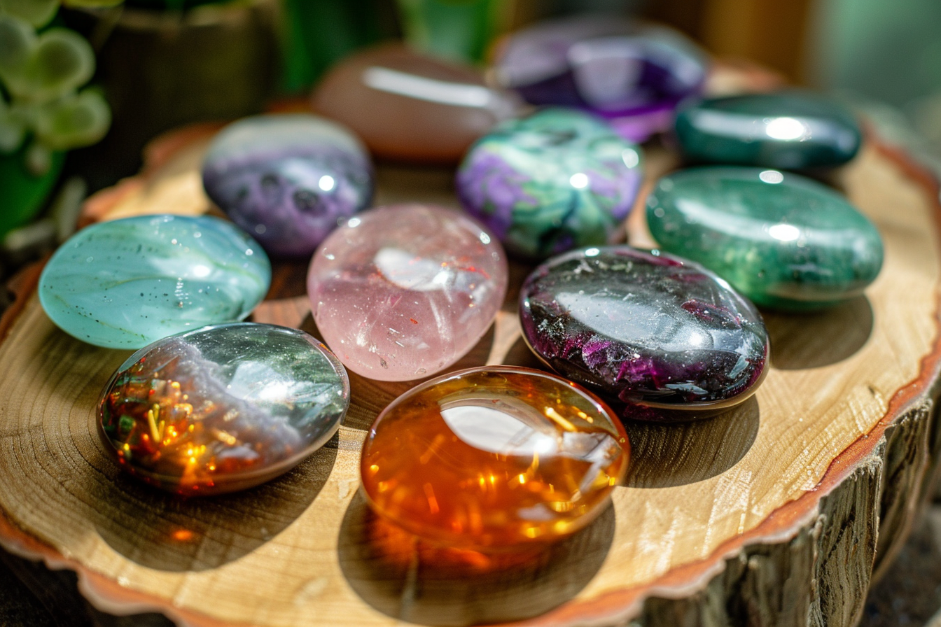
Yes. Turquoise is a well-known gemstone. Teal can be represented in stones like blue apatite, fluorite, or certain shades of tourmaline.
Which color is more spiritual?
Turquoise has deeper spiritual associations across cultures, but Teal holds space for emotional grounding and thoughtful stillness—making both meaningful in different ways.